In “The Blue-Eyed Salaryman,” American author Niall Murtagh charts his fourteen-year career inside Mitsubishi Japan. When Murtagh gets transferred to Osaka, he concludes that the Tokyo part of the company focuses on large visionary research projects, while Osaka demands practical applications. And there you have it: the dichotomy that accounts for Mitsubishi’s progress in the automotive arena. You have visionary products like the Evo with very little practical purpose, and dull products like the Outlander with very little vision. So where does the new Lancer fit?
Never mind the subtext, check out those lines! Designing a good-looking compact car ain’t easy nowadays. You’ve got to maximize interior space, accommodate an expanding complement of airbags and facilitate fuel efficiency with aerodynamics that force sheetmetal shapes down the slippery slope towards suppository chic. Things can go horribly wrong; reference the Honda Civic sedan. Or the previous Lancer, which was as sexy as dental floss. But Mitsubishi’s design team nailed this one.
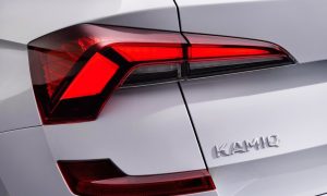
The Lancer’s proportions and details are spot on. The high beltline adds to the impression of size from the outside, yet allows occupants to feel surrounded and safe. Mitsu ripped off the tail lamp design from the Alfa 156– a gorgeous machine that Americans never got the chance to ignore. The Lancer’s new front fascia copies Audi’s current pig snout and makes it work, flanking the orifice with a set of angry eyes headlights and bisecting the otherwise gaping maw with a suitably wide bumper.
Previous article
Mazda 2 In Detail


